Brand consistency means presenting your logo, colors, words and promise the same way wherever people meet your brand. It goes beyond design: voice, claims and the experience at each touchpoint count too, and people recognize and trust what stays the same.
I read the guides that rank for this query (Canva, G2, Shopify, Adobe, Mailchimp and Templafy) and compared them with our own live articles on November 22, 2026. They agree on the elements and the to-do list: guidelines, central assets, templates, audits. None gives a way to estimate the cost of drift in hours and dollars, an annotated example of one campaign drifting across channels, or a short list of rules with an owner and a place for each. This article adds those three.
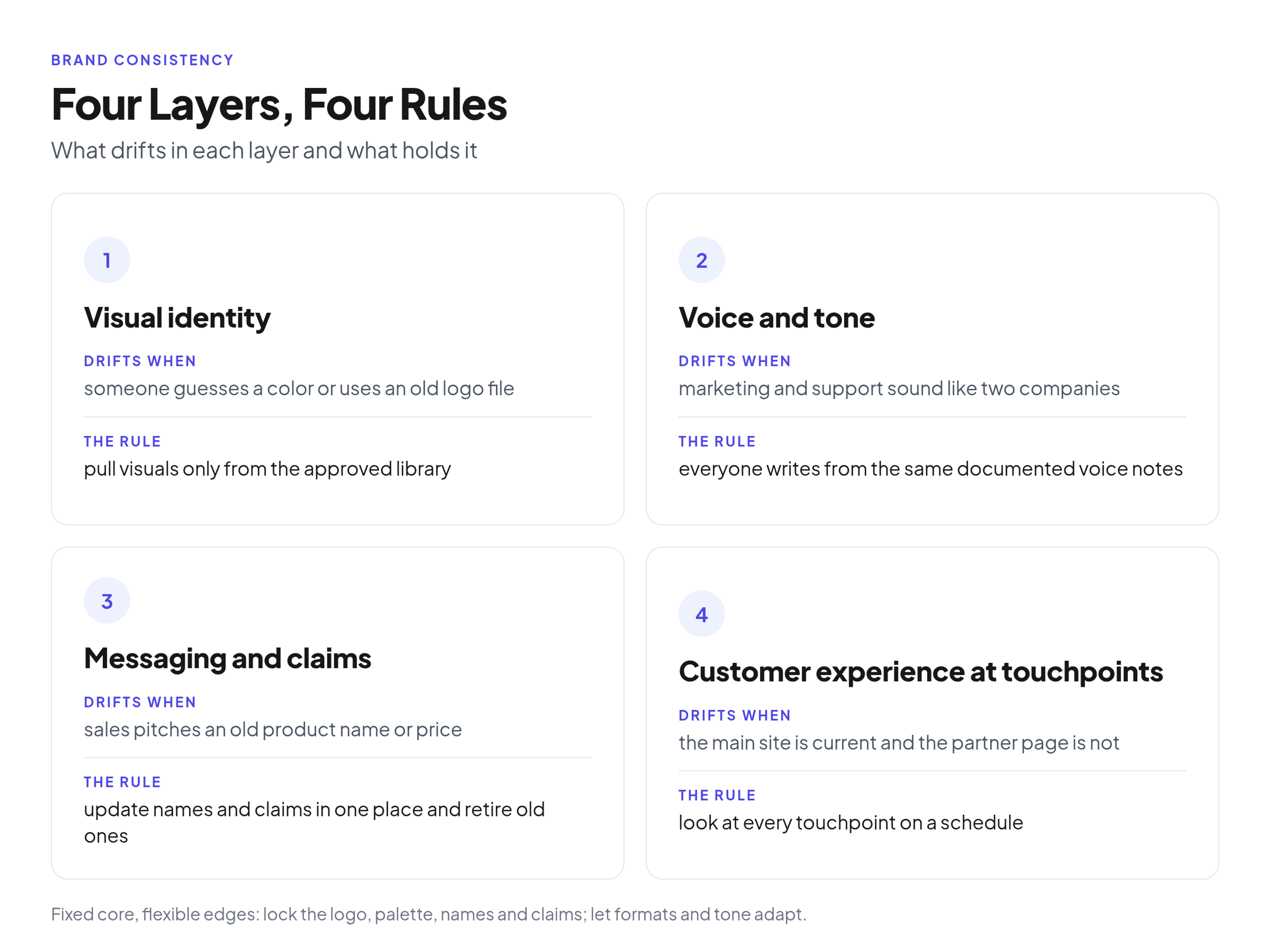
Infographic: the four layers of brand consistency, what drifts in each layer and the rule that holds it.
What brand consistency means (and what it does not)
Brand consistency means people get the same visual identity, voice, claims and experience wherever they meet you. It does not mean every asset looks identical: lock the core and let formats flex.
Canva's guide (page dated May 2026) defines it as "presenting your brand in the same way across all platforms and all touchpoints." In marketing, it is the day-to-day work of keeping those touchpoints in line.
Think of it as a fixed core and flexible edges.
- Fixed core: your logo, primary palette, company and product names, product claims and central promise.
- Flexible edges: image formats for each social channel, tone for a legal notice versus a launch announcement, and translation and local nuance.
A brand can be highly consistent and still feel fresh. The goal is that a customer who opens your email, visits your pricing page or sits through a webinar knows who is talking, and that nothing contradicts anything else.
This article assumes the guidelines exist. If you are still at that stage, see writing the guidelines this article assumes exist.
The four layers of brand consistency
Brand consistency has four layers: visual identity, voice and tone, messaging and claims, and customer experience at touchpoints. Each drifts in its own way, so each needs its own rule.
G2's guide lists these elements: visual identity, voice and tone, core values and messaging pillars, and customer experience across touchpoints. I keep the four layers separate because the drift and the fix differ in each one.
Visual identity
This layer covers the logo, color palette, typography, imagery style and layout grids. It drifts when someone guesses a hex code, stretches a logo to fit a banner, or an agency works from an old file.
The rule: pull visual assets only from the approved library. Nobody guesses a color or grabs a logo from image search.
Voice and tone
Voice is the personality. Tone is how that personality shifts with the situation. Drift shows up when marketing writes crisp, benefit-led copy while support writes dense, technical text, and the customer feels like they are dealing with two companies.
The rule: everyone who writes for the brand, in marketing, product or support, works from the same documented voice notes.
Messaging and claims
This layer covers positioning, exact product names, prices and required legal lines. It drifts when the product team renames a feature and sales keeps pitching the old name, or when a promotion goes out that customer success has not heard about.
The rule: names and claims are updated in one place, and retired claims are removed from circulation.
Customer experience at touchpoints
This layer spans your website, email, sales decks, support pages, packaging and partner channels. Drift is easy to spot when the main site looks current and the partner page looks a decade old.
The rule: every touchpoint gets looked at on a schedule, not only when someone complains.
Why brand consistency matters
Brand consistency matters because people recognize and trust what looks and sounds the same, and because drift costs your team time. The figures below come from vendor surveys and press releases, so read them as directional, not as proof.
The same Canva guide (May 2026) cites a Marq report: "68% of companies said brand consistency has increased their revenue growth from 10% to over 20%." That is a vendor-cited figure about what companies said, not an independent measurement.
A Lucidpress (now Marq) press release from December 2, 2019 reported a survey of "over 200 organizations." It said "81% of companies still deal with off-brand content" and that "consistent branding can increase revenue by 33%." Lucidpress sold brand templating, so treat this as directional too.
Loyalty research gives context, though it does not measure consistency. In a CivicScience press release from September 10, 2026, the share of U.S. adults who describe themselves as "very loyal" to their favorite brands rose from 31% in 2020 to 36% in 2026. The release also says "emotional connection to brands accounts for as much as 90% of the variation in self-reported loyalty," across 23 demographic groups and more than one million U.S. adults surveyed from January 2020 to January 2026. That is about emotional connection, not about consistent branding. Still, it is hard to build a connection with a company that looks and sounds different at every touchpoint.
In the guides I read, the revenue numbers come from vendor surveys or are repeated second-hand. That is why I'd lean on your own counts, in the worksheet below.
What inconsistency costs: a four-line worksheet
You can estimate the cost of drift with four lines: rework, extra review rounds, rebuilding and one-off corrections. Count your own last 30 days and multiply by your loaded hourly rate (what an hour of that person costs you, overhead included).
- Rework: off-brand pieces fixed per month x hours to fix x loaded hourly rate.
- Extra review rounds: pieces x extra rounds x hours per round x rate.
- Rebuilding: assets recreated because the right file was not found x hours to recreate x rate.
- One-off corrections: reprints, takedowns and re-sent emails. Take these from actual invoices.
Illustrative example. The numbers below are made up to show the arithmetic. They are not data from any real team. Replace them with what your team did in the last 30 days.
- Rework: 20 pieces x 1.5 hours x $60 = $1,800
- Extra review rounds: 30 pieces x 2 extra rounds x 0.5 hours x $60 = $1,800
- Rebuilding: 10 assets x 2 hours x $60 = $1,200
- One-off corrections: 1 scrapped print run = $500
- Total for the made-up month: $5,300
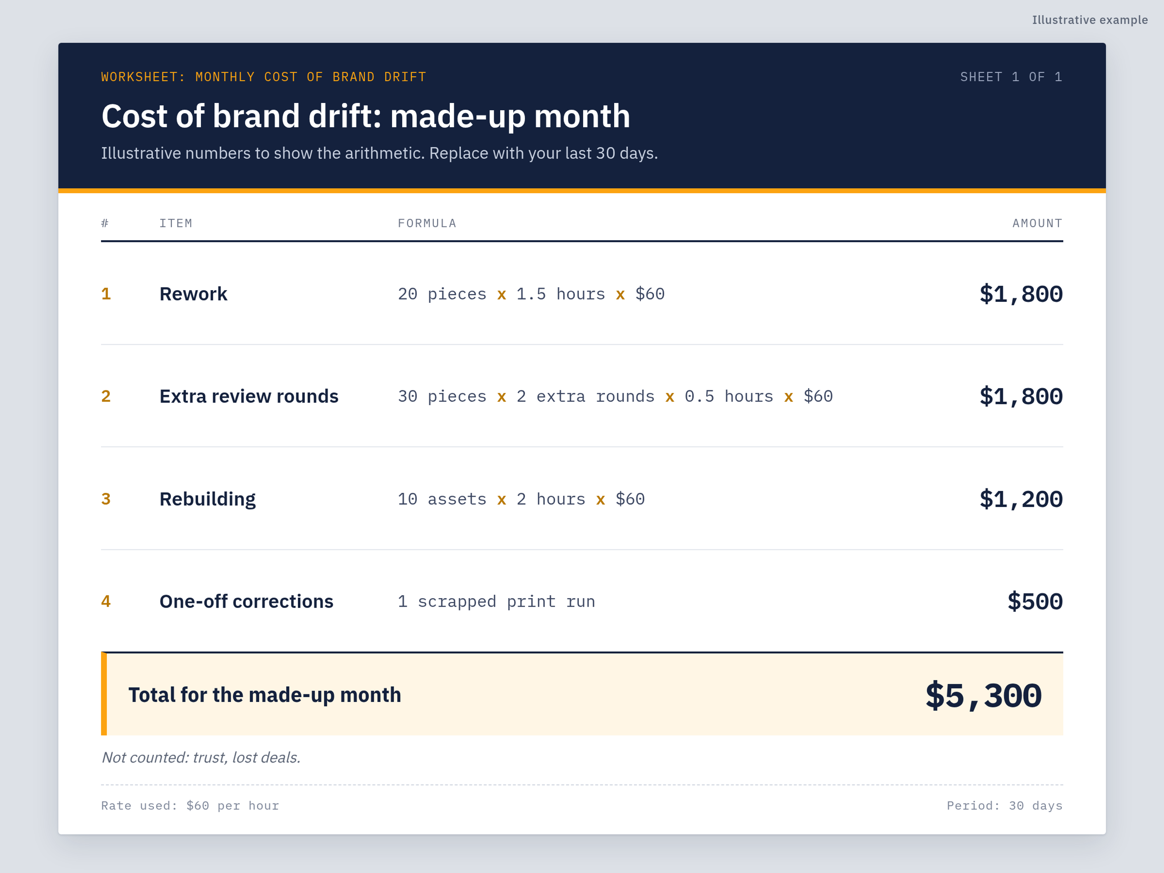
Illustrative example: a worked cost-of-drift worksheet with made-up round numbers, four lines adding up to $5,300.
The worksheet leaves out what is hard to count: trust that erodes when a customer sees a broken logo, and deals lost because a sales deck looked careless. Treat your total as a floor, not a full picture. It is still a number a stakeholder can react to, which "it looks off" never is.
Brand consistency examples
The clearest brand consistency example is a launch where every channel uses the same logo, palette, product name, claims and voice. Drift is what happens when the same launch is rebuilt separately by each team.
What the guides point to
I'd rather tell you what the guides say than invent details about big brands. Nike's "Just Do It" is used as an example by Canva, G2 and Mailchimp. Mailchimp's guide also cites Starbucks. Adobe's guide cites Airbnb, Google and Coca-Cola. These are recognizable reference points, but they say little about how a team of five or fifty gets there. A failure example is more useful for that.
One launch, four channels
Here is how one launch drifts. The scenario is made up to show the pattern: a fictional software company launches a new feature, the core team builds good assets, and the files travel by email attachment and chat message.
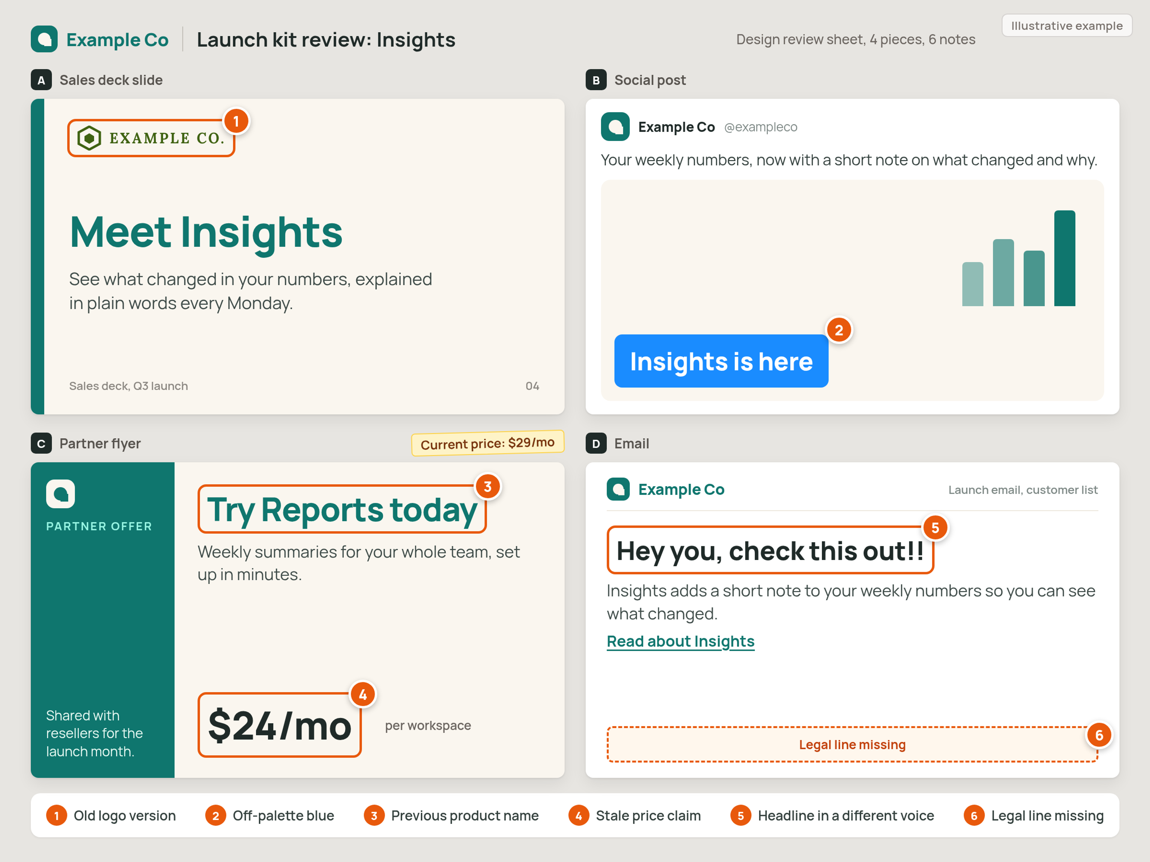
Illustrative example: one launch from a fictional software company drifting across a sales deck, a social post, a partner flyer and an email, with six callouts.
- Sales deck: an old logo version, copied from an old shared drive.
- Social post: an off-palette blue, because someone guessed the hex code.
- Partner flyer: the previous product name.
- Partner flyer: a stale price claim.
- Email: a headline in an informal voice that does not match the rest of the brand.
- Email: the required legal line is missing from the footer.
Callouts 1 and 2 are visual identity drift, 3, 4 and 6 are messaging and claims, and 5 is voice and tone. Every one of them is a touchpoint problem too. The customer sees four pieces that do not seem to come from the same company, and each fix costs one of the four worksheet lines.
The rules that hold
Six rules keep brand consistency from sliding back: one source of truth, templates, a named owner, a short checklist, a quarterly look at what is live, and retiring old versions. Each rule only holds if it has one owner and one place.
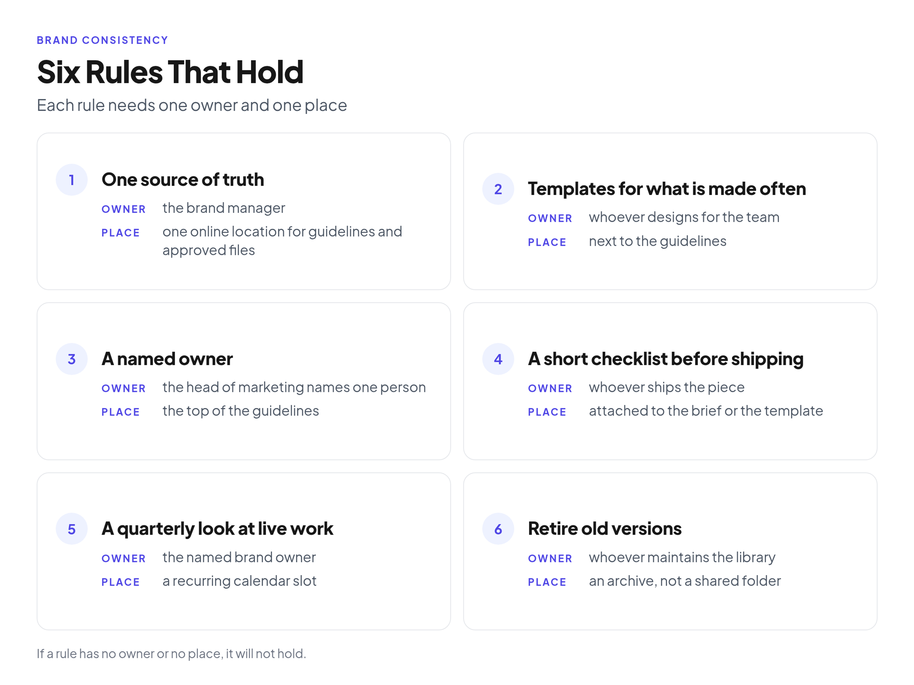
Checklist: the six rules that hold, each with an owner and a place.
- One source of truth. *Owner:* the brand manager. *Place:* one online location for guidelines and approved files, linked from every brief, deck and onboarding doc. If a file is not there, it is not approved.
- Templates for anything made often. *Owner:* whoever designs for the team. *Place:* next to the guidelines, so people find the template before they open a blank file. Social graphics, sales decks and common documents are the first candidates.
- A named owner. *Owner:* the head of marketing names one person. *Place:* the top of the guidelines, with a name and a way to reach them. For the decision side, see who owns the rules, approves exceptions and checks finished work.
- A short checklist before shipping. *Owner:* whoever ships the piece. *Place:* attached to the brief or the template. A few questions are enough: right logo file, right colors, current names and claims, legal line present.
- A quarterly look at a sample of what is live. *Owner:* the named brand owner. *Place:* a recurring calendar slot. Pull a handful of live pieces from the website, social, email, decks and partner materials and note which layer drifted. Canva's guide says an audit monthly or quarterly can catch off-brand colors, outdated logos or inconsistent messaging.
- Retire old versions. *Owner:* whoever maintains the library. *Place:* an archive, not a shared folder everyone can see. If an old logo sits in a folder, someone will use it.
Where a brand portal fits
A brand portal is one place for your guidelines and approved files, which is what rule 1 asks for. A tidy shared drive can do this job, but a portal built for it makes the single source of truth easier to keep.
Brandportal is a brand portal that combines online brand guidelines with a brand asset library. You can run public or password-protected portals, organize files in folders and keep version history. Share links cover external partners, roles (Admin, Editor, Viewer) control who can change things, and viewers are unlimited and free. Metadata and tagging help people find the right file, and analytics are included.
If your rules still live in a PDF, moving a PDF brand book to a living web page is the natural first step. To compare options, see plans and the 14-day free trial.
Common mistakes
The most common mistakes are leaving old files in circulation and expecting partners to follow rules nobody wrote down.
- Sending raw files over chat instead of a link to the one approved location.
- Leaving retired logos and old decks in shared folders.
- Forgetting partners and vendors. Adobe's guide lists third-party vendors or partners among the challenges, along with maintaining consistency and rebranding.
- Giving regional teams no flexibility, so they break the rules just to get work done.
- Skipping the checklist when a deadline is tight.
- Treating guidelines as a one-time project instead of something someone maintains.
FAQ
What do you mean by brand consistency?
Brand consistency means presenting your brand the same way across channels and touchpoints: the same visual identity, voice, claims and experience. Canva's guide defines it as "presenting your brand in the same way across all platforms and all touchpoints." The core stays fixed and the execution adapts to the context.
Can you give me an example of brand consistency?
A product launch where the sales deck, social post, partner flyer and email all use the same logo, palette, product name, price claim and voice, and carry the required legal line. The drift example above is the opposite case. Among real brands, the guides I read most often point to Nike's "Just Do It."
What are the 5 C's of branding?
There is no single official list, and the lists vary by source. One source, Ethos, lists clarity, consistency, creativity, connection and commitment, so consistency is one of them.
Are Gen Z less brand loyal?
The one source I use here does not show that. In CivicScience's September 10, 2026 release, by December 2025 self-reported "very loyal" was highest among U.S. adults 18 to 24, at 46%. So this study does not show Gen Z as less loyal.
Why is brand consistency important?
Consistent brands are easier to recognize and trust, and drift costs your team rework, extra review rounds and rebuilt assets. The revenue figures I cite come from vendor surveys, so treat them as directional and use the worksheet for your own numbers.
How do you maintain brand consistency?
Keep approved files and guidelines in one place, use templates for work made often and name one owner. Run a short checklist before shipping, look at a sample of live work each quarter, and retire old versions.
Conclusion
Brand consistency holds when each layer has a rule and each rule has an owner and a place. I'd start with the worksheet, because a number from your own last 30 days makes the case faster than any definition.
Next, find which layer drifted most in that sample, assign its rule to one person, and put the approved files in one place. Do those three things first and the rest gets easier.