To create brand guidelines, set the foundation, turn logo, color, type and voice into rules with examples, test them, publish and name an owner.
The job often lands on a marketing or brand manager, along with a folder of mixed design files and a request to make everything consistent. Treat the guide as an operating manual, not an art project. People want to know which logo goes on a slide, which blue to use for a button and where to download the right font.
The format matters less than the decisions. Some teams start with a PDF. Others keep their online brand guidelines and asset library in one place so rules and files sit together. Either way, the steps below are the same, and each one produces an output the next step needs.
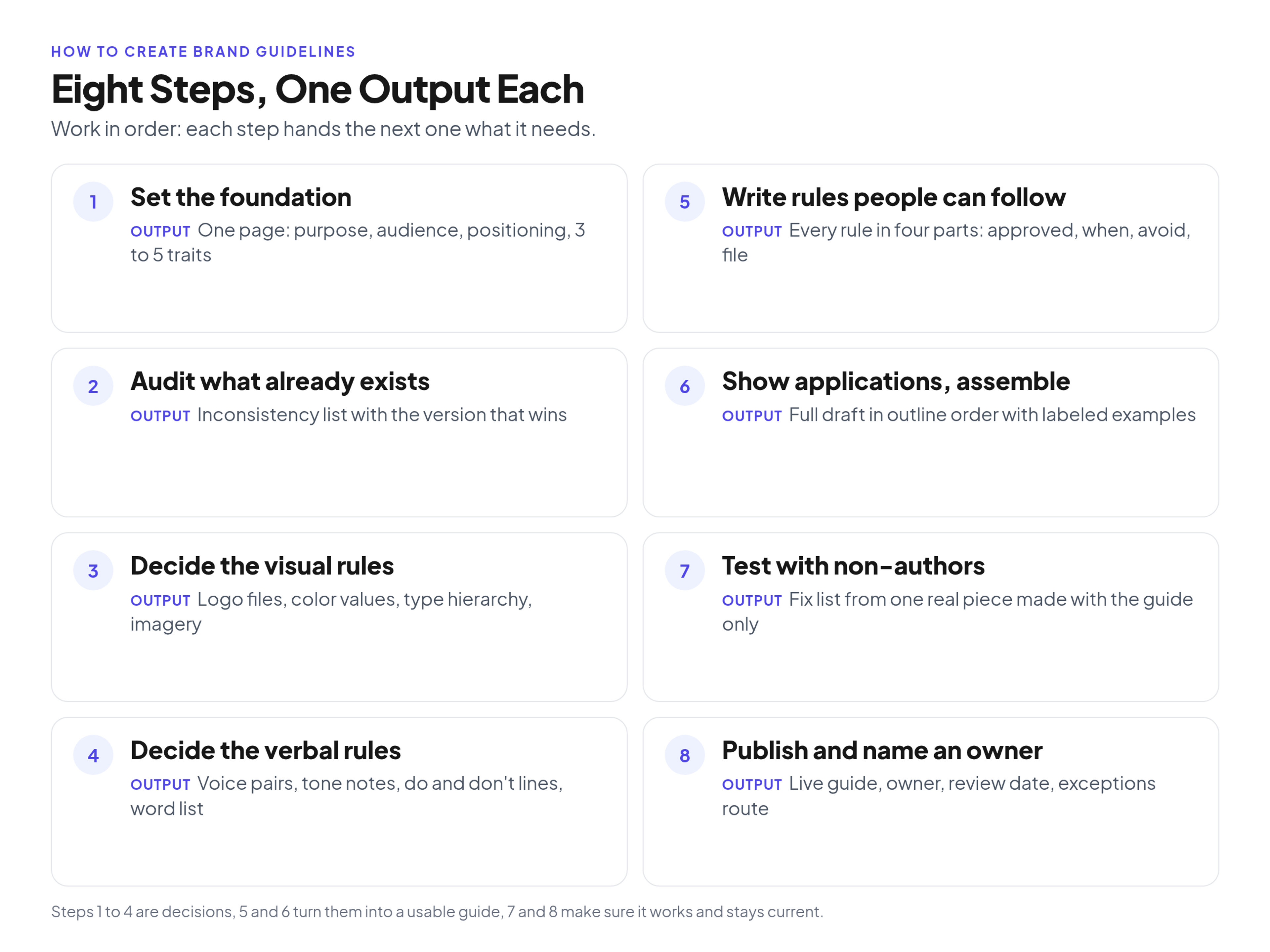
The process in order; each step produces one output the next step needs.
Before you start
Before writing anything, name one owner, line up a designer, a writer and a few future users, and collect the logo files, color values, font licenses and recent materials you already have.
Who is involved
Rules written by one person in isolation rarely survive real work. A small group is enough:
- Owner: usually the marketing or brand manager, who makes the final call when the group disagrees.
- Designer: turns raw visual files into usable standards.
- Writer: makes the verbal rules as clear as the visual ones.
- Future users: someone from sales or partnerships and, ideally, a designer at an outside agency. They are your reality check in Step 7.
What to have in hand
- Master logo files in vector format, plus variations already in use.
- Color values from the original design files.
- Font files and the licenses that cover them.
- Recent materials: sales decks, ads, social posts, email templates, partner one-pagers.
If something is missing, such as a vector logo or a clear font license, sort it out now, before the guide depends on it.
Scope of version one
Plan a short core guide: foundation, logo, color, type, imagery, voice, a few applications and contacts. A basic guide that ships beats a complete one stuck in review. Add sections once people are using the first version.
Step 1: Set the foundation
Write the brand's purpose, audience, positioning sentence and three to five personality traits on one page. Every later decision gets checked against it.
The foundation is a filter. If the positioning says you are a premium consultancy for enterprise buyers, that sentence rules out cartoon illustrations before anyone debates them.
- Purpose: why the company exists beyond making money.
- Audience: who you talk to, described by role and daily problems.
- Positioning: one sentence on what you do, who it is for and why your approach differs from the alternatives.
- Personality traits: three to five adjectives, such as "authoritative, approachable, precise."
The traits do the daily work. A copywriter can ask whether an email sounds authoritative and approachable, and rewrite it if not. If a strategy document already exists, pull these four parts from it instead of starting over.
Output: a one-page foundation the group agrees on.
Step 2: Audit what already exists
Collect every logo, deck, ad, social post, email and partner piece in circulation, compare them side by side and list each inconsistency with the version that wins. That decision list is the baseline for your rules.
Put everything in one place, on a large table or a shared digital whiteboard. Include easy-to-forget items like email signatures and the sales team's own slide templates. In a typical audit you find things like:
- Several shades of blue across the website, print and slides.
- An old logo still living in email signatures.
- One presentation font in marketing and another in sales.
Decide item by item which version wins. If you have four blues, keep the one that fits the foundation and retire the rest. If no option is good, flag it for Step 3 instead of picking the least bad one.
Output: an inconsistency list with a decision next to each item.
Step 3: Decide the visual rules
Decide the logo versions, color values for screen and print, the type hierarchy with licensed files, and imagery direction. The designer should own the technical details.
This step covers only the decisions. For the full inventory, see a section-by-section breakdown of what the guide should contain.
Logo versions, clear space and misuse
Name the primary logo and any secondary versions, such as a stacked lockup or an icon-only mark, and say when each is used. Then define:
- Clear space, using a unit taken from the mark itself (for example, the height of one letter) so it scales with the logo.
- Minimum size for print and for screens.
- Misuse, shown rather than described: stretched, rotated, recolored or placed on busy backgrounds.
- Trademark symbols, if you use them. The U.S. Patent and Trademark Office's basic facts booklet on trademarks says to use ® only once the mark is federally registered, and only with the goods or services listed in that registration. Until then, you can use TM for goods or SM for services, whether or not you have filed an application.
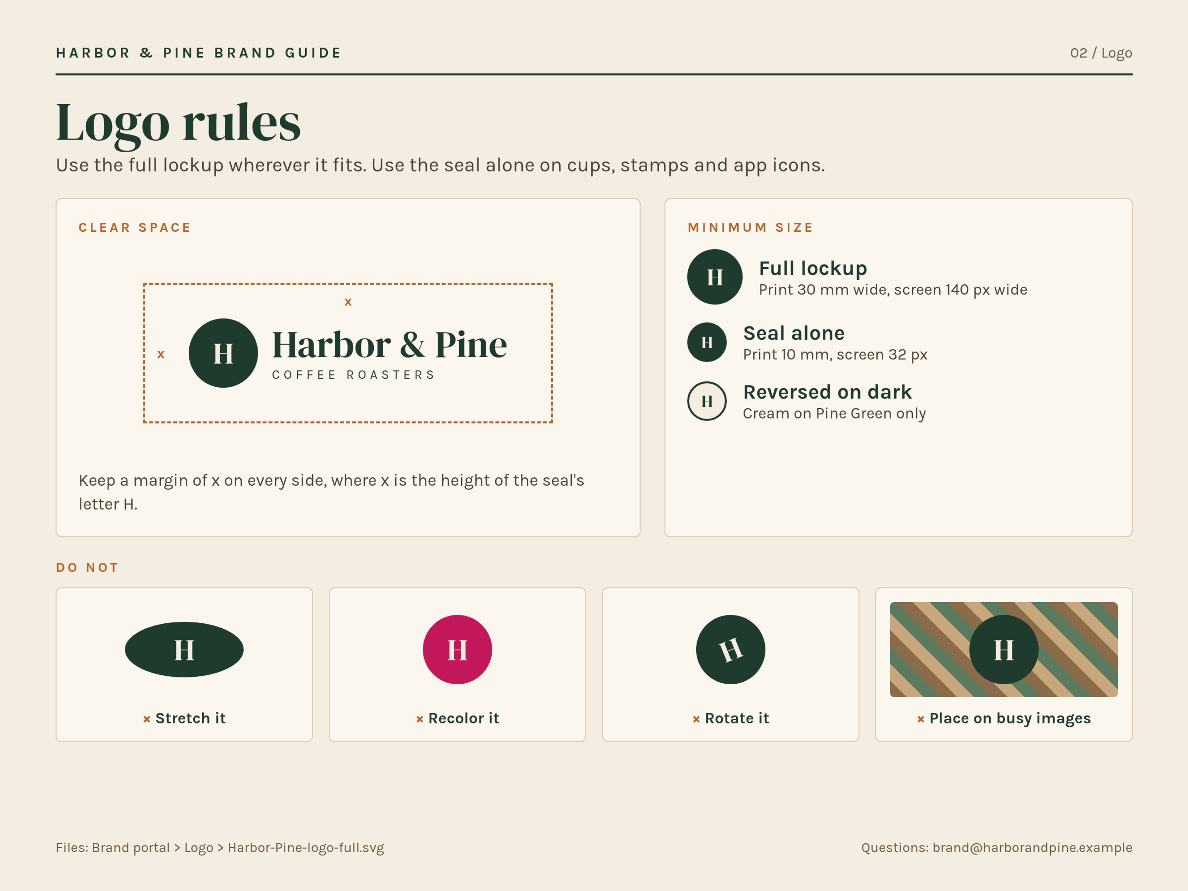
Illustrative example: a logo page with clear space, minimum size and misuse rules for a fictional coffee roaster, Harbor & Pine. Names and data are invented.
Color values for screen and print
For each brand color, list HEX and RGB values for digital, CMYK for print, a Pantone reference if print quality matters, the color's role (primary, accent, background, text) and which text colors may sit on it so contrast stays readable. Copy values from the original design files, not from a screenshot.
If you list Pantone colors, know what the number refers to. Pantone explains that its master standards are spectral data, which it calls a color's DNA, set at the initial printing of each Pantone Matching System color when the system was relaunched in 2010. They do not change and are based on the Pantone Formula Guide on coated paper stock. Paper and press still affect the printed result, so ask for a proof on important jobs.
Typography and font licenses
Set the hierarchy: font and weight for headlines, subheads, body copy and buttons, plus a fallback for when the brand font is unavailable, such as a deck opened on a partner's laptop.
Then check licensing. Monotype's overview of font licensing principles is clear on the basics: a font file is software that requires an appropriate license, and font designs and software are entitled to IP protection even when they are free. Record which license covers which use (desktop, web, apps), who holds it and where the files live. If you cannot confirm a license, do not share the font file through the guide.
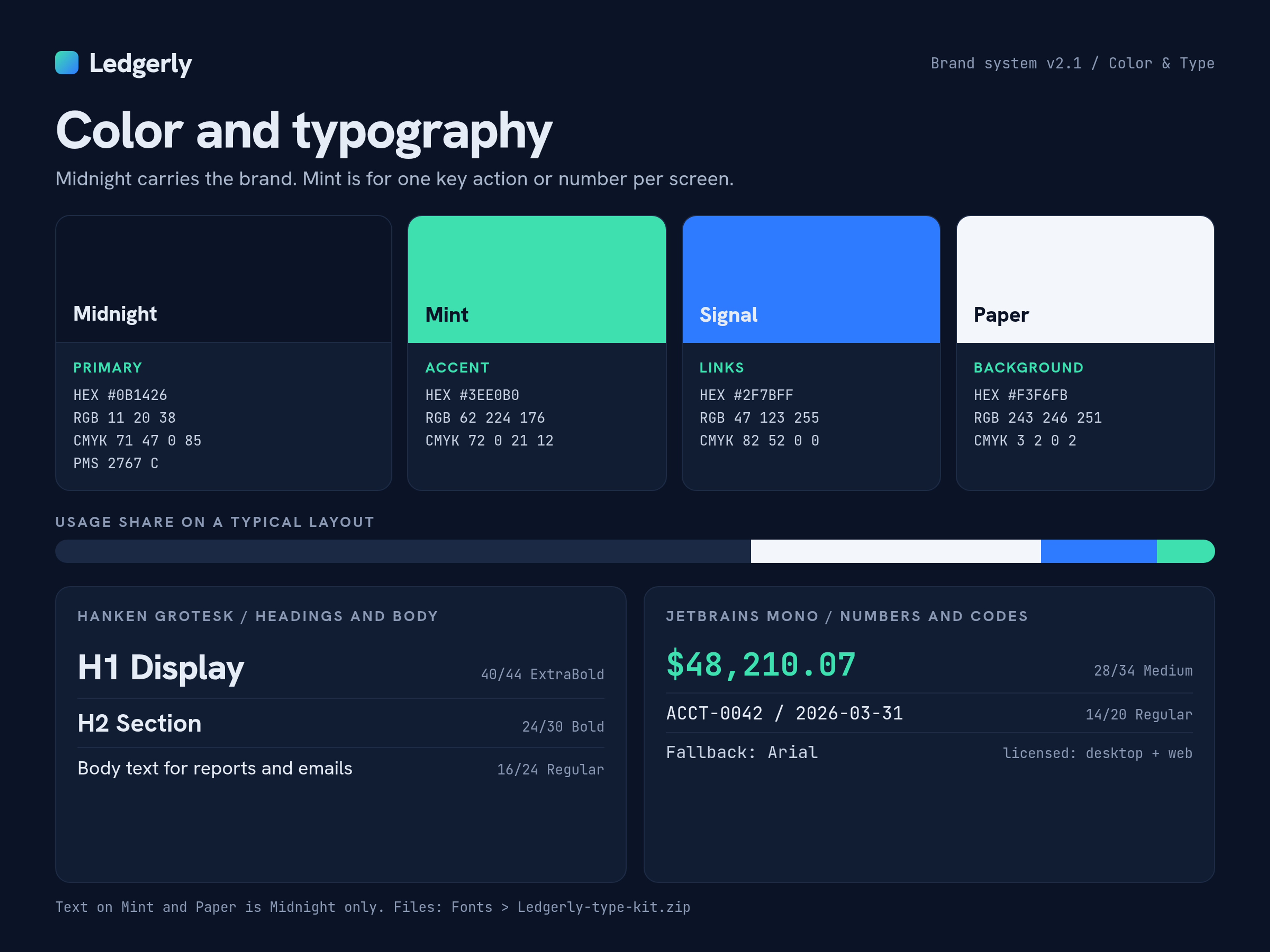
Illustrative example: a color and typography page for a fictional fintech brand, Ledgerly. Names and data are invented.
Imagery and icons
Say whether the brand uses photography, illustration or both. For photos, describe subject, lighting and mood, with approved examples next to ones that miss. For icons, name the style and where the approved set lives.
Output: approved logo files, color values with roles, a type hierarchy with licensed fonts, and imagery direction.
Step 4: Decide the verbal rules
Turn the personality traits into voice rules, explain how tone shifts by situation, add do and don't rewrites and keep a word list of terms spelled one way.
Voice traits and tone
Expand each trait into a "we are, but we are not" pair:
- We are professional, but we are not stiff.
- We are confident, but we are not arrogant.
The second half stops writers from overcorrecting. Then note how tone shifts while the voice stays the same. A launch email can be upbeat, while an outage notice should be calm and specific about what happens next. Give one line of direction for each situation your team writes for often.
Do and don't lines
One generic sentence next to a rewrite in the brand voice teaches more than a paragraph of adjectives.
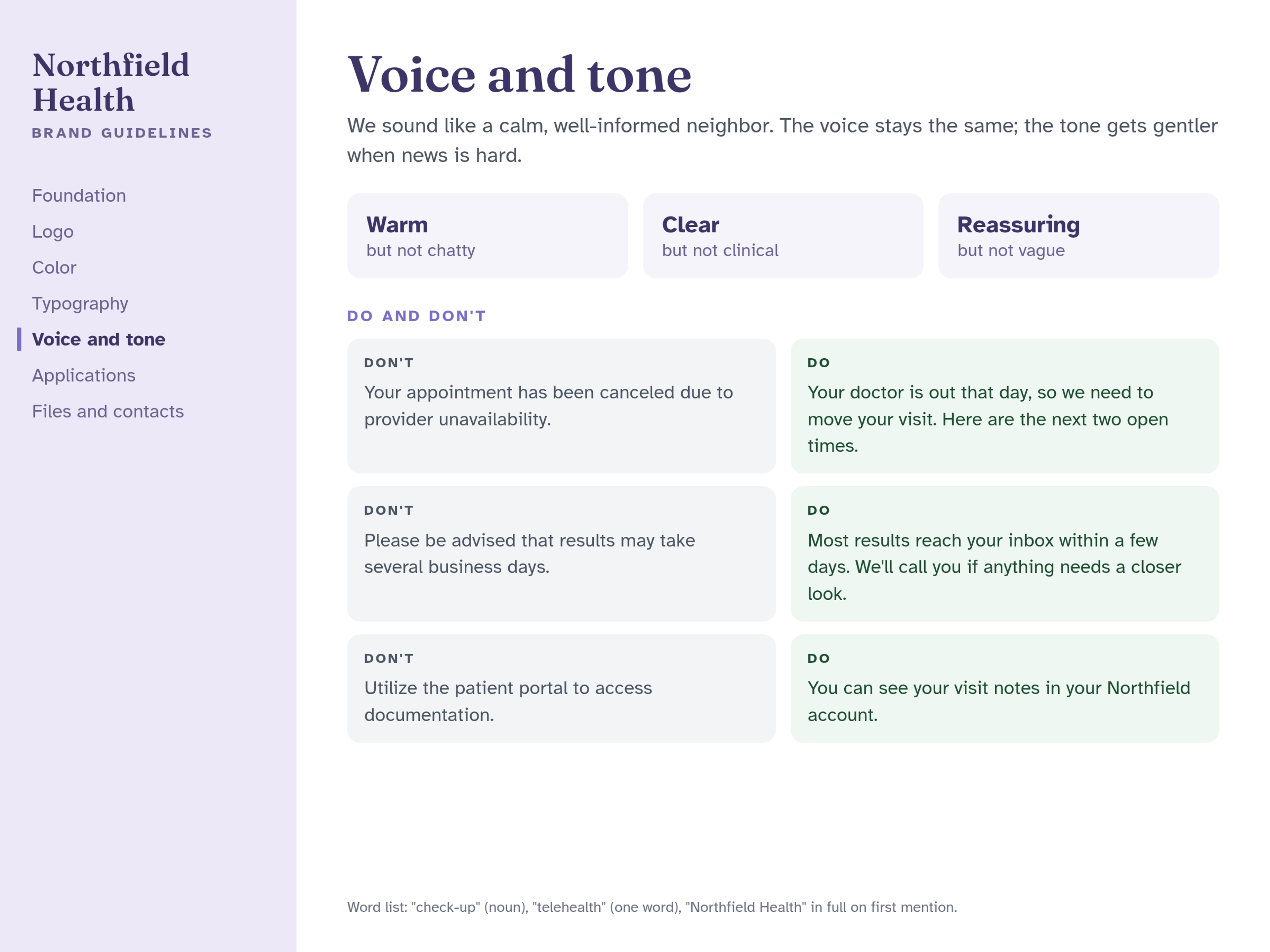
Illustrative example: a voice and tone page with do and don't lines for a fictional clinic network, Northfield Health. Names and data are invented.
A front-desk pair for Northfield Health might read:
- Don't: "Your appointment has been canceled due to provider unavailability."
- Do: "Your doctor is out that day, so we need to move your visit. Here are the next two open times."
The rewrite is plainer, says what happens next and sounds like a person.
A word list
Product names, industry terms and internal jargon tend to get spelled several ways. Decide capitalization, one word or two, hyphenation and how your company name is written. Mailchimp's public word list is one example of this kind of controlled vocabulary: words that "can be slippery," each with the spelling the team uses. Start yours with the terms your audit turned up.
Output: a voice page with trait pairs, tone notes, do and don't lines and a word list.
Step 5: Write rules people can follow
Write every rule in four parts: what is approved, when to use it, what to avoid and where the file lives. Anyone can follow a rule that has all four without asking for help.
"Use our logo correctly" is the classic weak rule. It does not say what correct means, which mistakes to avoid or where the file is.
Weak: "Use our logo correctly."
Usable:
- Approved: The primary full-color logo is the default.
- When: Use it on white or light gray backgrounds. On dark backgrounds, use the reversed white logo.
- Avoid: Never stretch it, recolor it or place it over busy photography.
- File: Download the approved vector and PNG files from the Logo folder.
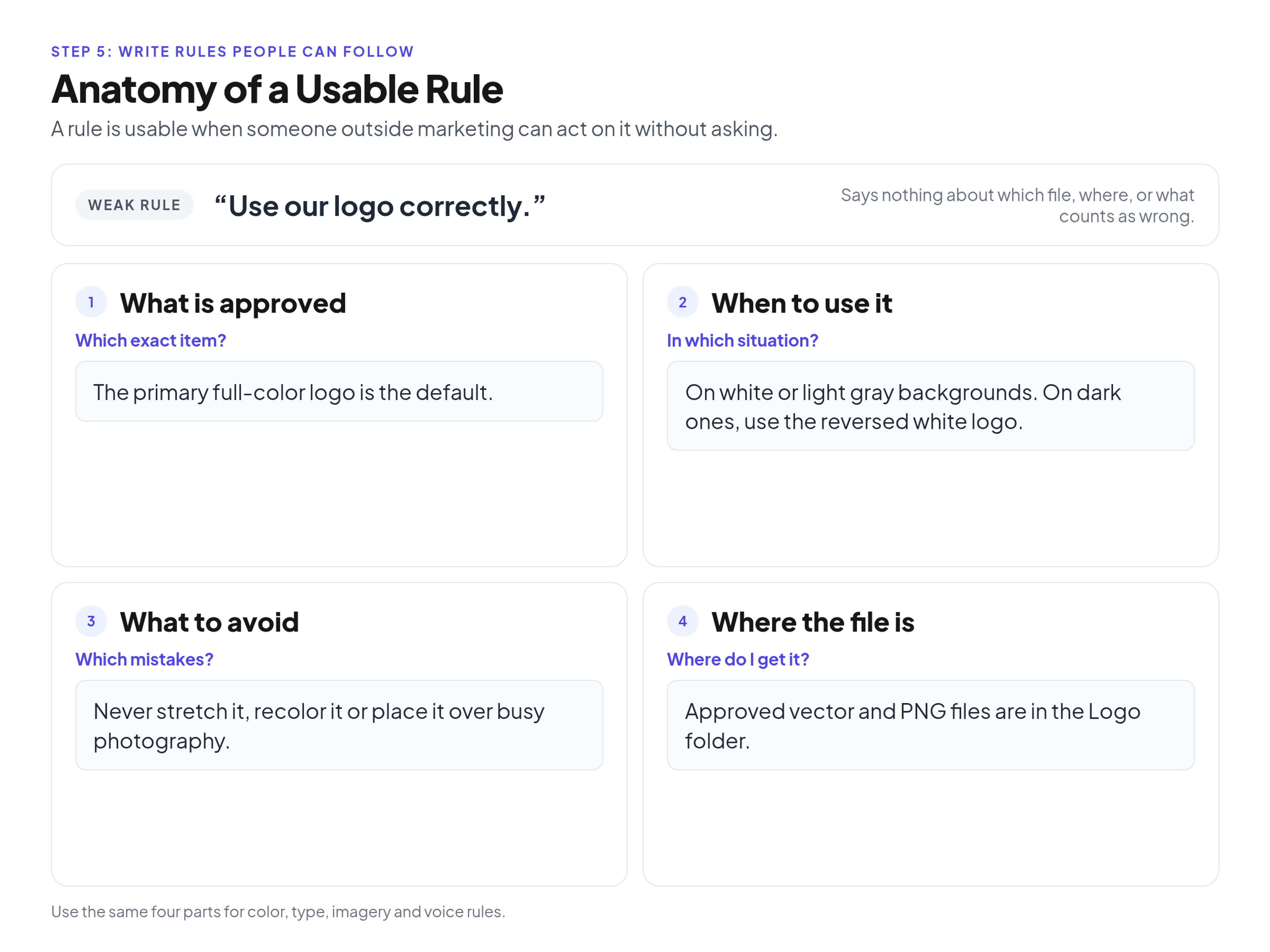
Anatomy of a usable brand guideline rule: what is approved, when to use it, what to avoid, and where the file lives.
The pattern works in every section:
- Color: "Primary blue is for buttons and large headlines. Don't use it for small body text on gray. Swatches are in the Color folder."
- Type: "The headline font is for H1 and H2 headings. Don't set it in all caps. Licensed files are in the Fonts folder."
A quick check: could someone outside marketing act on the rule today without a follow-up question? If not, one of the four parts is missing.
Output: every rule rewritten in the four-part pattern.
Step 6: Show real applications and assemble the guide
Show the rules applied to real pieces, such as a social post, a slide, an email header and a business card, then put the guide in an order people can scan. You can copy the outline below.
A designer can read a palette, but a sales manager needs to see it on a slide. For each application, show a finished piece and label what it uses: logo version, colors, type styles. Start with the pieces your team makes most often, which the audit already showed you.
People search a guide rather than read it front to back. Move from strategy to execution and end with files and contacts:
- Foundation: purpose, audience, positioning, traits.
- Logo: versions, clear space, minimum size, misuse.
- Color: palette, screen and print values, contrast rules.
- Typography: hierarchy, weights, fallbacks, license notes.
- Imagery: photography, illustration, icons.
- Voice: traits, tone, do and don't lines, word list.
- Applications: finished, labeled examples.
- Contacts and files: who to ask, where to download, how to request an exception.
Output: a full draft in outline order, with labeled applications.
Step 7: Test the draft with people who did not write it
Give the draft to two or three people who did not write it, ask each to make one real piece using only the guide, and fix every place they get stuck. Authors miss these gaps because they already know the answers.
Pick testers who match your real users and give each a concrete task. For example, a sales rep builds a one-page flyer for an upcoming event, and a designer at an outside agency creates a social media carousel.
Then watch, and do not help. If someone asks which blue to use, point them back to the guide. Every question and every pause marks a gap: a missing CMYK value, a broken link to the font files, a rule that never says when it applies.
Fix each gap and look at the finished pieces too. If a tester followed the guide and the result still looks off-brand, the rule is the problem. The draft is ready when testers can finish without asking you anything.
Output: a fix list from the testers and a revised draft.
Step 8: Publish where people work and name an owner
Publish the guide where the team already looks for files, with the files next to the rules. Then name one owner, set a review date and give people a way to request exceptions.
A PDF can work for version one, but copies saved to desktops outlive every color change you make. There is a separate article on publishing the guide as a living web page instead of a PDF.
Then set up basic governance:
- Owner: one person, not a department, who keeps rules and files current and says no when a request does not fit.
- Review date: a recurring check on the calendar, so outdated rules surface before someone complains.
- Exceptions route: an email address or request form for unusual projects, so people ask instead of improvising.
The guide will change as the company does. When it does, follow a version and changelog routine for later updates so people can see what changed.
Output: a live guide with an owner, a review date and an exceptions route.
How templates and AI drafting fit
Templates and AI drafting can speed up layout and a first draft, but they cannot make the decisions. Check color codes, font licenses and file links yourself.
A template gives you a clean grid for logo pages and a starting order of sections. An AI assistant can help brainstorm personality traits or draft do and don't lines.
Neither knows your brand. AI cannot audit your materials to find which blue sales actually uses, read the terms of your font license or know which HEX values the group approved. It can also produce plausible-looking values that are wrong. Before anything goes into the guide, check:
- Color values against the original design files.
- Fonts against the licenses you hold.
- Every rule against the four-part pattern.
The decisions, and responsibility for them, stay with the group.
Common mistakes
The usual mistakes are rules nobody can act on, missing files, an overlong first version, a skipped test and no owner. Each one has a direct fix.
- Untestable rules. "Keep it clean" leaves people guessing. Rewrite with the four-part pattern.
- Documenting a weak identity. If the audit shows the identity is confusing or outdated, fix the core problems before writing them into rules.
- Rules without files. A type page with no font files sends people to whatever looks close. Put the file next to the rule.
- A first version that is too long. A huge manual overwhelms the people it is meant to help. Ship the core and extend it.
- Skipping the test. Authors cannot see the gaps, but testers can.
- No owner. Files go stale, questions go unanswered and people drift back to old versions.
FAQ
Who should create brand guidelines?
A small cross-functional group led by one owner, usually the in-house marketing or brand manager. Include a designer for the visual rules, a writer for the verbal rules and a few future users from sales, partnerships or an outside agency to test the draft.
How long does it take to create brand guidelines?
It depends on three things: whether the identity already exists or you are fixing it as you go, how many sections version one covers and how many review rounds stakeholders need. Documenting a clean, existing identity is much quicker than redesigning one.
What is the difference between brand guidelines and a style guide?
The terms are often used interchangeably. When they differ, brand guidelines cover the foundation and the visual and verbal identity of the whole organization. A style guide is usually narrower: a content style guide for grammar and word choice, or a UI style guide for product design.
Can a small business create brand guidelines without a designer?
Yes, within limits. You can write the foundation, voice rules and word list yourself and document the logo and colors you already have. Get vector logo files and exact color values from whoever made the logo or from the original files, not from a screenshot. If there are no vector files, or the identity needs real fixes, bring in a designer for that part.
What are examples of brand guidelines?
This article includes three illustrative pages for fictional brands. The first is a logo page for Harbor & Pine, a coffee roaster. The second is a color and typography page for Ledgerly, a fintech brand. The third is a voice and tone page for Northfield Health, a clinic network. Many companies also publish their guidelines or style guides openly, and comparing a few shows how others structure the same sections.
What are the 5 C's of branding?
The "5 C's of branding" is an informal marketing heuristic, not a standard. Versions differ between sources, and the C's listed differ by author. Use it as a prompt when you write the core identity in Step 1 and the voice and tone rules in Step 4, so purpose, positioning and personality stay consistent across materials.
What is the 3-7-27 rule in branding?
The "3-7-27 rule" is an informal marketing heuristic, not a standard, and versions differ between sources. It is told both as seconds of attention and as numbers of exposures, so treat the numbers as a mnemonic rather than a measured result. Use it as a reminder when you set logo, color and typography consistency in Step 3, so the visual system stays recognizable across applications.
Conclusion
Creating brand guidelines is a sequence of decisions: set the foundation, audit what exists, decide the visual and verbal rules, write them in four parts, show applications, test with people who did not write them and publish with an owner. Start with a short core guide and improve it from real use.
The test is the easiest step to skip under deadline pressure, and it is the one that tells you whether the guide works. If a sales rep can make a real piece from the guide alone, you are ready to publish.
If you want the rules and files in one place, brandportal.to lets you publish public or password-protected brand portals with folders, version history, share links, Admin, Editor and Viewer roles, and unlimited free viewers. If that fits how your team works, see plans and the 14-day free trial.