Brand guidelines should include the instructions a person who has never worked with your brand needs to represent it correctly: a short overview of who you are and who you speak to, logo versions and usage rules, a color palette with codes for screen and print, a type hierarchy, imagery and graphic style, voice and tone with examples, a few real applications, and a note on who owns the guide and where the files live.
Most teams already have pieces of this scattered across a PDF, a slide deck and a shared folder. The question is not whether you have a document titled "brand guidelines." The question is whether someone else can pick the right logo, set a headline, choose a photograph and write a caption without asking you. The rest of this guide walks through each section, what belongs in it, and a completeness test you can run on what you have today.
The sections that belong in brand guidelines
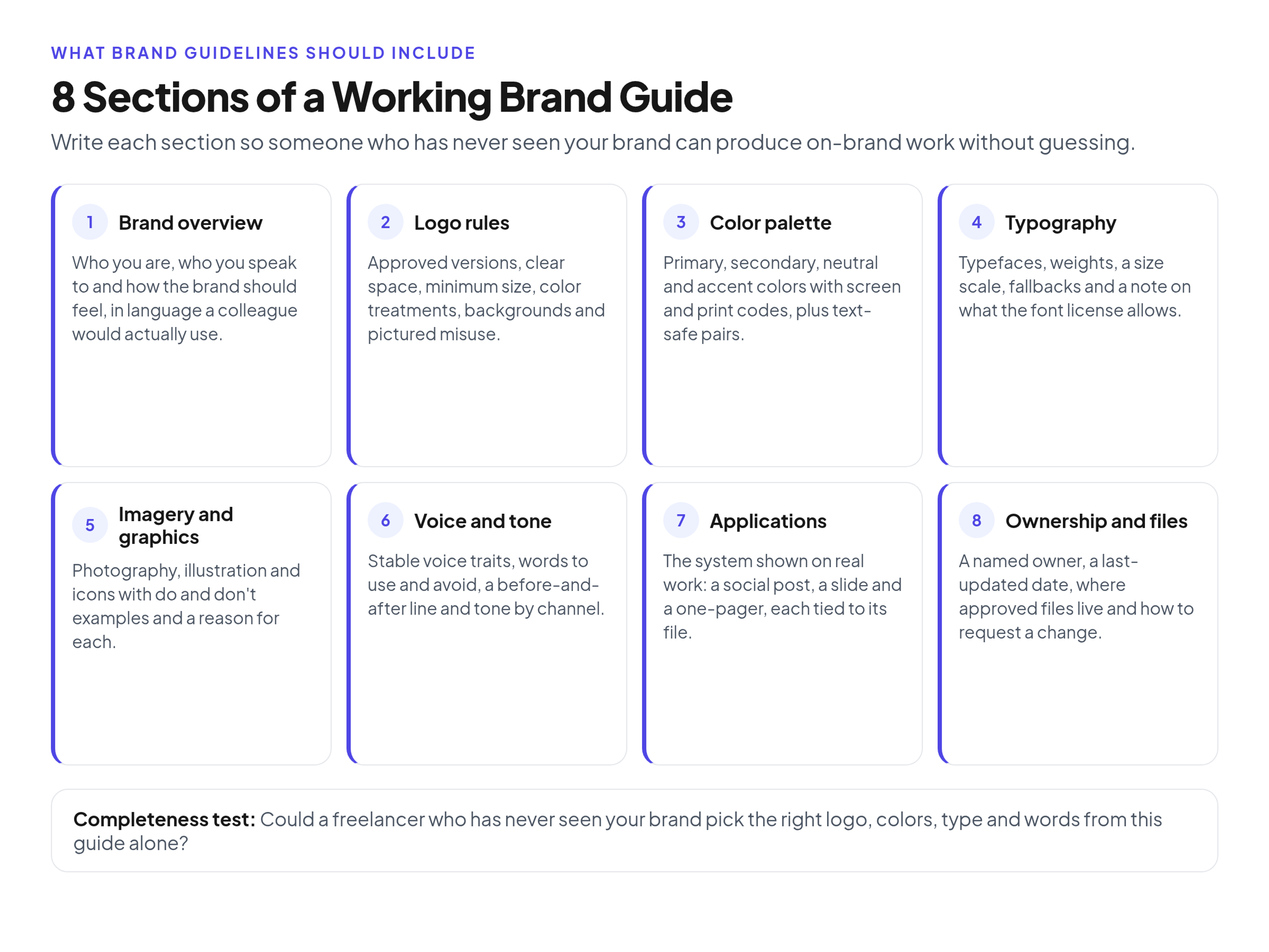
A useful guide is a working manual, not a design award submission. These are the sections I look for, in the order a new reader typically needs them:
- Brand overview: who you are, who you speak to and how the brand should feel
- Logo guidelines: approved versions, clear space, minimum size, color treatments and misuse
- Color palette: primary, secondary, neutral and accent colors, with codes and text-safe pairs
- Typography: typefaces, weights, hierarchy, fallbacks and licensing notes
- Imagery and graphics: photography, illustration, icons and other graphic elements, with do and don't examples
- Voice and tone: how the brand writes, words to use and avoid, and how tone shifts by channel
- Applications: the rules shown on real materials, such as a social post, a slide and a one-pager
- Ownership and files: who updates the guide, when it was last changed and where the approved files live
You do not have to ship every possible extra (motion, packaging, a full UI kit, partner lockups) on day one. You do have to make each section you publish complete enough to use. A heading with a logo pasted underneath is not a logo section.
A worked example: a guide that looked finished
Here is a composite example I will call Harborline, a 40-person B2B software company. The company, people and files are illustrative, not a real client. I built it from a pattern I see often: a PDF that looks official and still leaves a freelancer guessing.
On a Friday afternoon the marketing manager sent `Harborline_BrandGuidelines_FINAL.pdf` (16 pages) to a freelance designer hired to produce two LinkedIn ads and a one-page PDF for a Monday webinar. The PDF contained:
- A mission statement and three values ("customer-first," "clear," "reliable")
- The primary logo on a white background, and a sentence that said "do not stretch the logo"
- Six color swatches. Two had HEX values. None had RGB, CMYK or a note about which colors could be used for text
- The typeface names Inter and Source Serif, with no sizes, weights, line heights or fallbacks
- Three stock photographs labeled "our photography style," with no explanation of why
- No voice section, no applications, no owner and no date
By Sunday evening the freelancer had sent questions the PDF could not answer. Which logo file should sit on a dark navy ad background? The pack only had the full-color mark on white. Is the bright teal approved for body text on white, or only for buttons? What size should the webinar title be? How should the ads be captioned, beyond "be professional"? Where is the SVG, and is sharing the font files allowed?
The designer made reasonable guesses and delivered on time. Two of those guesses were wrong: the logo was placed too close to the edge of a photograph, and the caption sounded like a generic SaaS ad rather than Harborline. Nobody had been careless. The guide had headings. It did not have answers.
Harborline then rebuilt the contents against the completeness tests below. They kept the overview and shortened it. They added a stacked logo, an icon, a reversed (white) version, a clear-space diagram, a 24px / 0.5 inch minimum size and a one-page misuse sheet. They added RGB and CMYK values and three text-safe color pairs. They specified headline, subhead and body sizes with weights and system fallbacks. They replaced the unexplained photos with three "do" and three "don't" images and a reason for each. They wrote three voice principles, one before-and-after product sentence, and a note on how social captions differ from sales decks. They showed the rules on one social post, one slide and one one-pager. They named the brand manager as owner, added a last-updated date and linked to the folder of approved files.
The next freelancer still asked a question (about a co-branded event lockup Harborline had never needed). That is a later section, not a failure of the core guide.
Brand overview
This section gives every visual and verbal rule a reason. It does not need to be a manifesto. A page or two is enough if it is specific.
Include a short positioning statement (what you offer, to whom, and what makes you different in language a colleague would actually say), a plain description of the primary audience, and three to five personality traits with a note on what each trait does not mean. "Friendly" without "not casual to the point of sloppy" will be read differently by a sales lead and a designer.
Skip generic values that could belong to any company unless you show how they change a decision. "Innovation" on its own does not tell someone whether a joke belongs in a product email.
Completeness test: Could a new hire write a one-sentence description of the brand that matches how you actually talk, using only this page?
Logo guidelines
The logo is the section people open first and misuse most. Include every approved version: the primary mark, a stacked or compact version, an icon or wordmark if you have one, and the color treatments you allow (full color, single color, reversed). If a product or partner lockup exists, show it here. If it does not exist, say so, so nobody invents one.
Then document the rules that stop the usual mistakes:
- Clear space, expressed as a proportion of the logo itself (for example, the height of the symbol on all sides), not "leave some room"
- Minimum size for screens (in pixels) and for print (in inches or millimeters)
- Which backgrounds the logo may sit on, and which version to use on a photograph or a dark color
- What not to do, shown as pictures: stretching, rotating, recoloring, adding outlines or shadows, placing it too close to other marks, or using an old version
A sentence that says "do not stretch the logo" is weaker than a small sheet of incorrect examples. People remember what wrong looks like.
The U.S. Patent and Trademark Office describes a trademark as a word, phrase, symbol, design, or combination of these that identifies your goods or services and helps customers recognize you and distinguish you from others. That is a practical reason to publish approved presentations and to retire old ones: inconsistent use makes the mark harder to recognize as yours. This is not legal advice, and registration is a separate decision from writing the section.
Completeness test: Could a freelancer pick the right file and place the logo on a photograph without asking you?
Color palette
List primary, secondary, neutral and accent colors, and give each one codes for the places you actually produce work. HEX and RGB cover screens. Add CMYK, and Pantone if you use a matched print process, before the first brochure, booth or packaging run. A palette that only lists HEX will be rebuilt by a printer, and the printed piece will not match the website.
Name the colors in a way people can say out loud ("Harborline Navy," not just "P-01"). Show typical roles: which color carries the logo, which is for backgrounds, which is for buttons or highlights, and which should stay rare so it keeps its punch.
Then list approved text-on-background pairs. MDN's summary of WCAG contrast guidance recommends a contrast ratio of at least 4.5:1 for body text and 3:1 for large-scale text to meet the AA level, and 3:1 for icons and other graphical objects. Those text ratios do not apply to logotypes, but they do apply to the headlines and body copy teams set in your colors. If a favorite brand color fails as text on white, say so and give the pair that does work (for example, navy text on white, white text on navy, and teal only for large headlines or UI chrome).
Completeness test: Could someone build a slide and a web banner using only the listed colors and know which pairs are safe for text?
Typography
Name the typefaces and the jobs they do: headlines, subheads, body, maybe captions or data. Specify the weights you actually use (not every weight in the family), a simple size scale, line height and how the pairing works (for example, Source Serif for titles and Inter for body, never the reverse). Include system fallbacks for email, third-party forms and anywhere your licensed fonts will not load.
Show the hierarchy on a sample page, not just as a list of font names. A name without a size is how webinar titles end up in whatever the template defaulted to.
Then record the license. Google Fonts' note on licensing is a useful reminder that every font, paid or free, has a license that states what users can and cannot do with the files, and that you should keep a copy of that license for each font you hold. Some licenses limit how many people may install the desktop files, how a webfont may be served, or whether the font can be embedded in an app or shared with an outside designer. Before you zip up font files for an agency, read the license. If it does not allow redistribution, point partners to the licensed source or to approved exported files (PDF, SVG, raster) instead.
Completeness test: Could someone typeset a one-page PDF and a social graphic in the right fonts, at the right sizes, without substituting a lookalike?
Imagery, icons and graphic elements
This section is how the brand feels once the logo is off-screen. Describe photography in concrete terms: lighting, crop, setting, who or what appears, and what to avoid (heavy filters, posed handshakes, cluttered backgrounds, whatever does not match you). Do the same for illustration and icons if you use them: stroke weight, corner style, whether metaphors are literal or abstract.
Show do and don't examples with a short reason under each. "Candid, well-lit photos of real work environments" is clearer when set next to a rejected image and the note "too staged, faces turned away from the work." If you have patterns, shapes or a graphic motif, document scale, color limits and where they may sit relative to type and the logo.
Add a one-line note on sourcing and rights: which library or photographer you use, who checks licenses, and that expired or unlicensed images must not go into new work. The details can live with the files. The rule belongs in the guide so people know to look.
Completeness test: Could someone pick or brief a photograph that looks like it belongs with last quarter's campaign?
Voice and tone
Visual rules will not stop a landing page, a support reply and a sales deck from sounding like three companies. Describe the voice as traits that stay stable (for example, clear, direct, calm) and the tone as what shifts by situation. A social caption can be warmer than a security advisory without breaking the voice.
Include:
- Three to five writing principles, each with a short explanation
- Words and phrases to use, and a matching list to avoid, drawn from language you have actually had to correct
- At least one before-and-after rewrite of a real sentence (a product announcement or a homepage line)
- How tone changes by channel: social, website, sales, support
"Be professional" is not a voice section. Two writers will professionalize in different directions.
Completeness test: Could two writers independently draft a product announcement that sounds like the same company?
Applications: show the rules on real materials
Rules become usable when people see them working. Include a small set of real applications, not a catalog of every deliverable you have ever produced. A practical starter set for a marketing team is one social post, one slide or report cover, and one one-pager or sell sheet. Add an email signature, a document template or packaging when those are how the brand regularly shows up.
Each example should name the logo version, colors, type sizes and image treatment it uses, and point to the working file. That is also where a long PDF starts to fail: the example is a picture of a slide, and the slide master lives in someone else's drive. If your guide still lives only as a file you email, how to rebuild a PDF brand book as a living online guide walks through moving these sections onto a page that can sit next to the files it describes.
Completeness test: Does the guide show at least three real pieces of work, not just logos and swatches on white?
Ownership, files and what to add later
Close the guide with the operational facts that keep it from rotting:
- A named owner (one person, even if others draft sections)
- A last-updated date, changed only when the content really changes
- Where the approved files live, and which formats to download for which job
- How to request a change or an exception
Once those basics exist, how to number, review and release updates to those sections covers version numbers, a changelog and a release workflow so a color fix and a new logo are not treated the same way.
Add later sections when the work appears, not because a checklist on the internet listed them:
- First print run: CMYK, Pantone and print minimum sizes, if they were not needed yet
- First in-product or website UI kit: buttons, form states, app icon, favicon
- First video or motion piece: pace, transitions, how the logo animates (or that it does not)
- First partner or co-branded event: lockups and what partners may and may not do
- Broader accessibility notes: besides contrast pairs, things like minimum type size and alt text habits for branded images
A short core that people use beats an 80-page book they ignore. When the guide is ready to leave your laptop, share the finished guide so teams and partners use the same version instead of attaching another "final" PDF.
Common gaps in brand guidelines
These are the holes that show up even in guides that look thorough:
- A logo file with no versions, sizes or misuse examples
- Colors without full codes, or with codes and no text-safe pairs
- Font names without sizes, weights, fallbacks or a license note
- Photography pulled from a stock search and labeled "our style"
- Voice described as "professional" or "friendly" with no examples
- No applications, so nobody sees the system working
- No owner, no date and no link to the current files
- Font files forwarded to partners without checking whether the license allows it
If you recognize three or more of these, you do not need a redesign. You need to finish the sections you already started.
Keep the rules next to the files people download
Guidelines fail in the gap between the rule and the file. The logo page should sit beside the SVG and PNG. The color page should sit beside any shared swatches. The applications page should sit beside the slide master. An online brand guidelines and asset library is built for that pairing: you can publish the guide, keep approved files in folders with version history, and send share links instead of attachments. Portals can be public or password-protected, and viewers are free, which makes it practical to give agencies and partners access to the current guide rather than a copy of last quarter's PDF.
FAQ
What is the difference between brand guidelines, a brand book and a style guide?
Teams use the names loosely. A brand book is often a designed PDF that tells the brand story and shows the identity. A style guide sometimes means visual rules only (logo, color, type) and sometimes means editorial rules (voice, punctuation, terms). Brand guidelines is the broader working manual: visual rules, verbal rules, examples and ownership. If your "brand book" already includes those and people can find the current files from it, you do not need a second document with a different title. You need the contents to pass the tests above.
What is the minimum a small team should include?
If you are a small team hiring the first freelancer or agency, ship overview, logo, color, type and voice, plus one or two applications. That set answers most "can you send me the brand?" requests. Add print codes, UI, motion and partner lockups when those jobs are real. A five-section guide that is complete will outperform a twelve-section outline with empty headings.
Do brand guidelines need accessibility rules?
They need the accessibility facts that change how people use your colors and type. At minimum, publish text-on-background pairs that meet a 4.5:1 contrast ratio for body text and 3:1 for large text, as summarized in the WCAG guidance above, and say which brand colors must not be used as small text. Expand later with minimum type sizes and habits for alternative text on branded images. Putting contrast in the color section beats a separate appendix nobody opens.
Should voice and tone live in the same guide as the logo rules?
Yes, for most small and mid-size teams. The people who open the guide to grab a logo are often the same people writing a caption or a landing page. Splitting voice into a separate document is how it gets forgotten. If your editorial guide is long (a full terminology list, grammar rules, legal phrases), keep that depth in its own page and link it from a short voice section in the main guidelines so the relationship stays obvious.
How often should we add new sections?
Add a section when a real job repeats and people are improvising. One custom event poster does not require an events chapter. A quarterly webinar series does. Review the guide on a fixed cadence (a light pass each quarter is enough for most teams) and ask what people have been guessing since the last update. Repeated questions are outlines for the next section.
Conclusion
Brand guidelines should include the context, the visual system, the verbal system, a few real applications and the operational facts that keep the document honest. Write each section so it passes a simple test: could someone who has never seen your brand produce on-brand work from this page alone? Start with overview, logo, color, type, imagery, voice and two or three applications, name an owner, and put the rules next to the files. When you want that setup in one shared place, see pricing.